Art Direction · Rebranding · Visual Identity

REBRANDING
REBRANDING
Redesign Accademia del Profumo’s visual identity to reflect its role in contemporary Italian fragrance culture while preserving its heritage, elegance, and institutional character.
THE CHALLENGE
Accademia del Profumo has built a strong presence in Italian perfumery through its awards and cultural initiatives. The challenge was to translate this heritage into a contemporary visual identity able to connect fragrance, culture, and Italian excellence.
FRAGRANCE AS CULTURE
Accademia del Profumo was founded in 1990 to give fragrance a cultural voice in Italy. Through its annual awards and cultural initiatives, it celebrates excellence in perfumery, supports emerging talent, and positions fragrance alongside fashion, art, and design as part of Italy’s cultural identity.
THE SOLUTION
Two distinct creative directions exploring fragrance as culture, emotion, and experience.
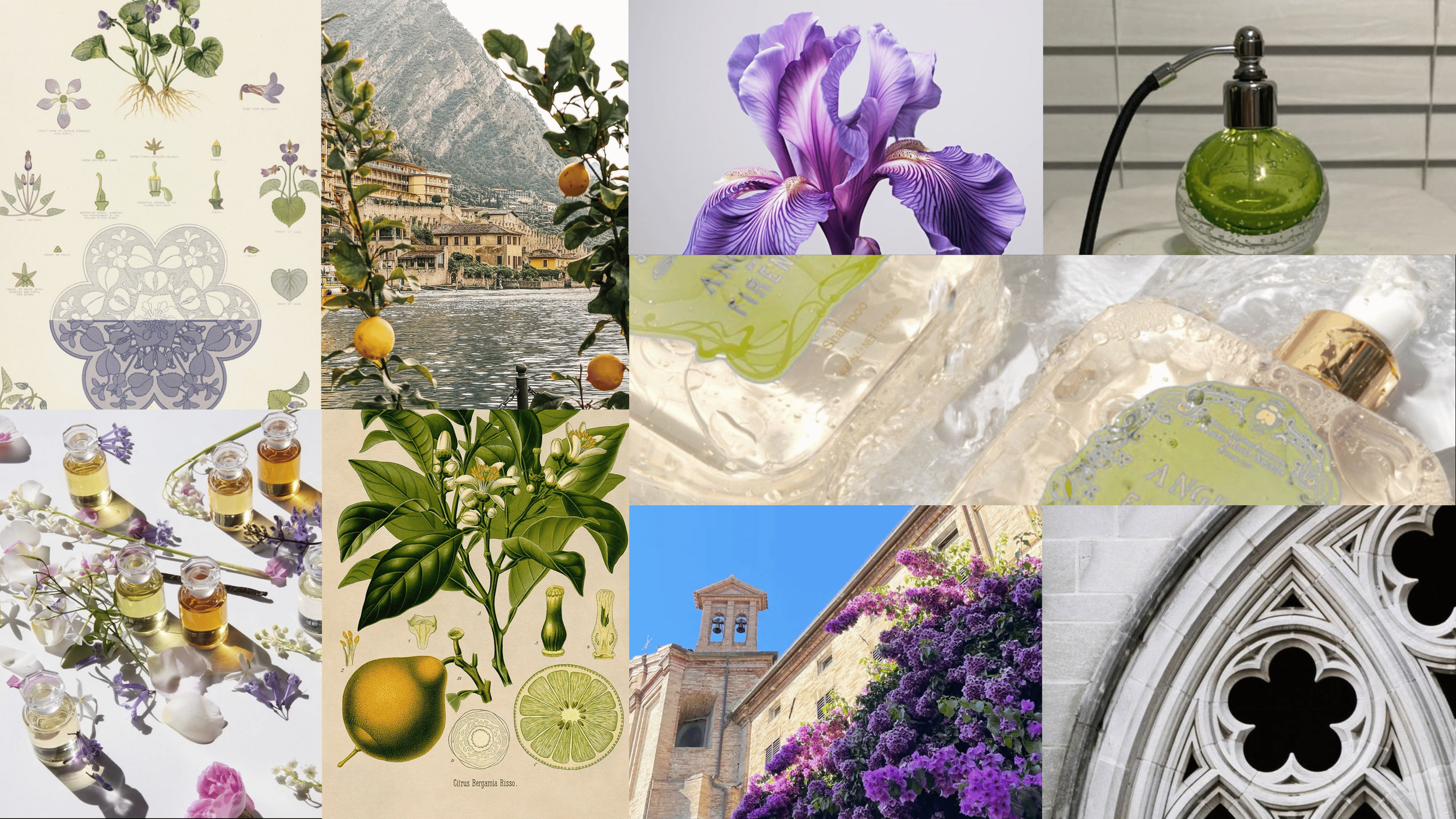
A DROP OF ITALY
AIR IN BLOOM
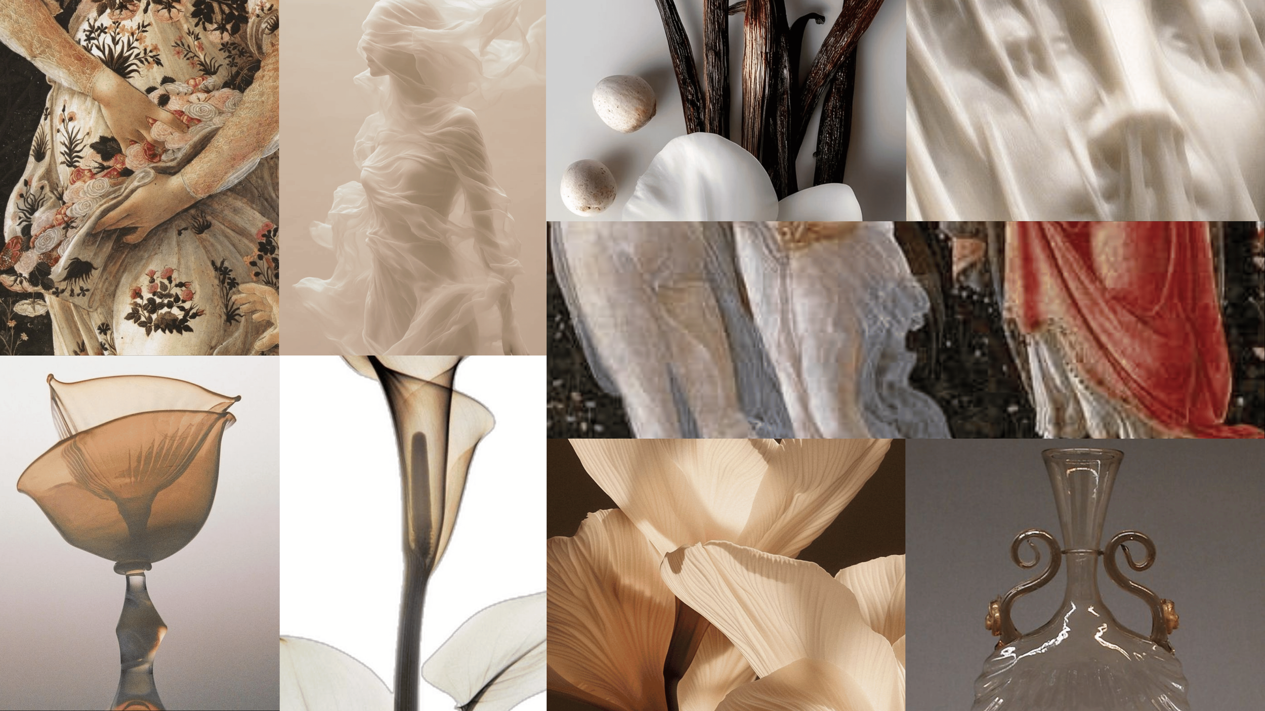
Both proposals reinterpret Accademia del Profumo through a contemporary visual language while preserving its connection to Italian perfumery. Each explores a different dimension of fragrance: one rooted in heritage and territory, the other in air, presence, and movement.
A DROP OF ITALY
A SYMBOL WHERE FRAGRANCE AND ITALIAN HERITAGE MEET
Concept 1
PRIMARY LOGO

BRAND MARK
WORD MARK
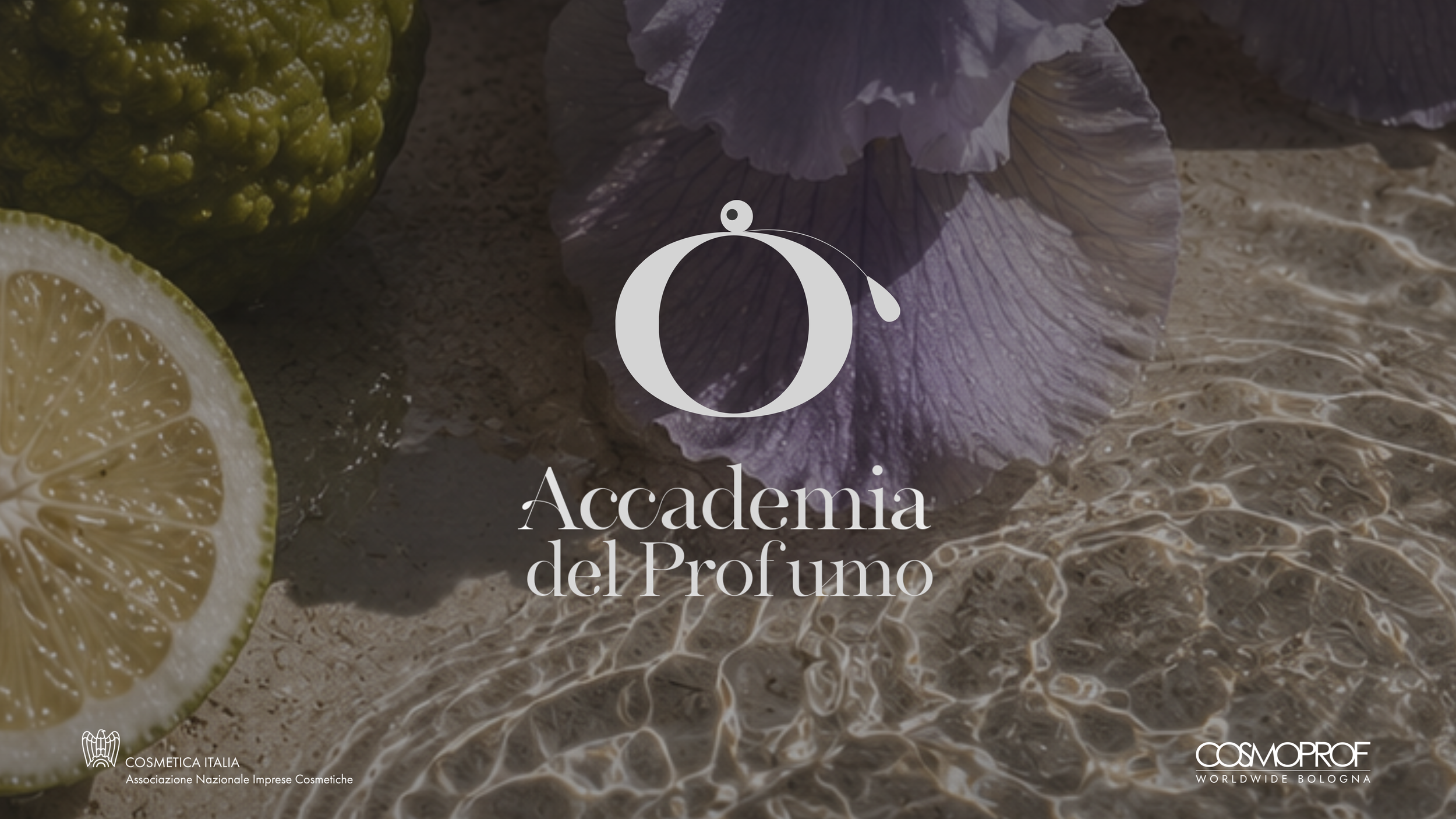
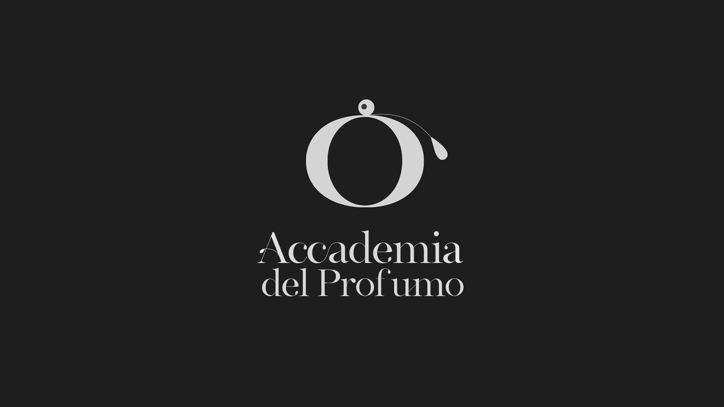
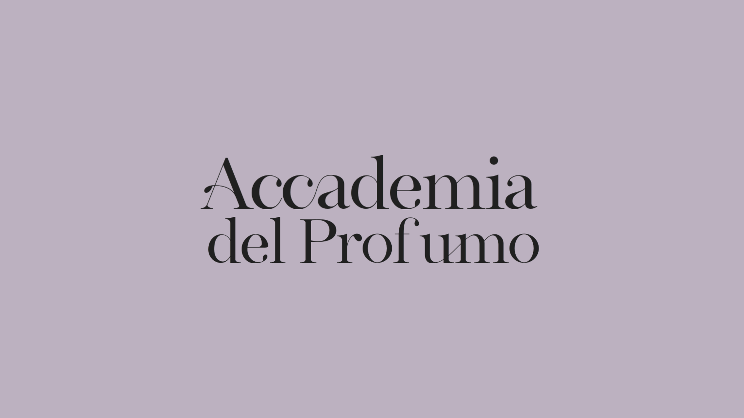
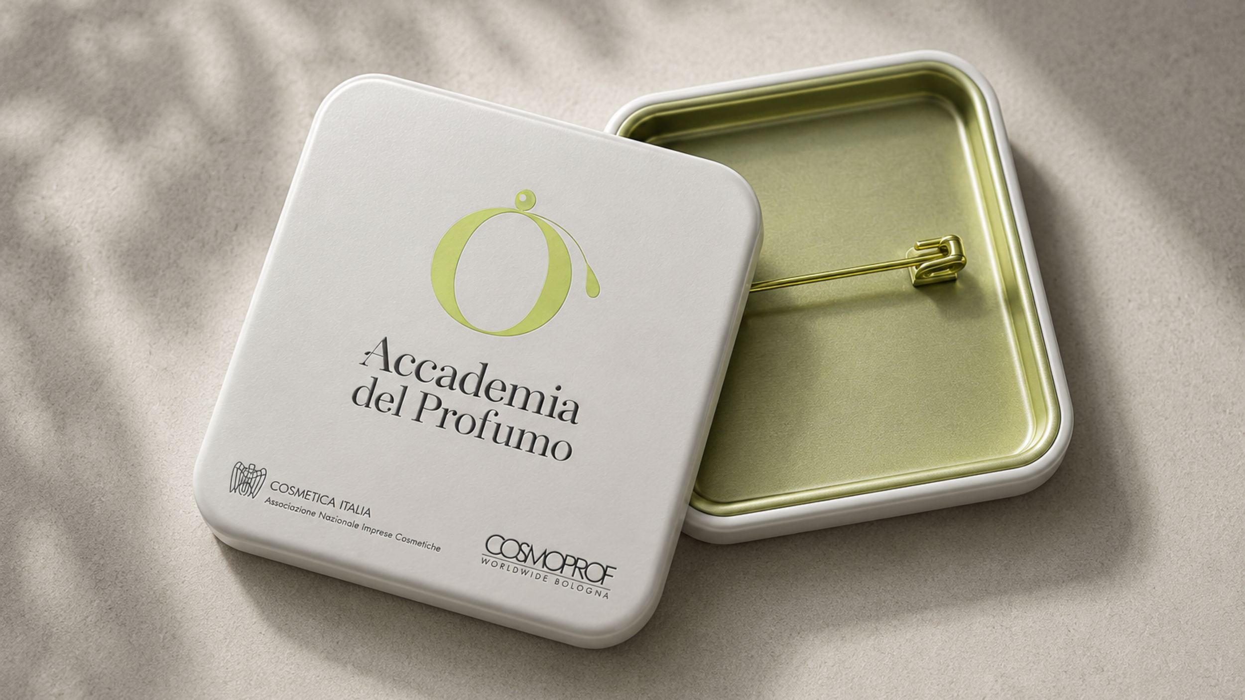
The identity transforms the initial “O” into a distinctive brand mark, combining the silhouette of a classic perfume bottle with the gesture of a falling drop. A simple visual idea that connects the institution directly to the world of fragrance.
THE VISUAL LANGUAGE
A color-coded system inspired by the ingredients and landscapes of Italian perfumery

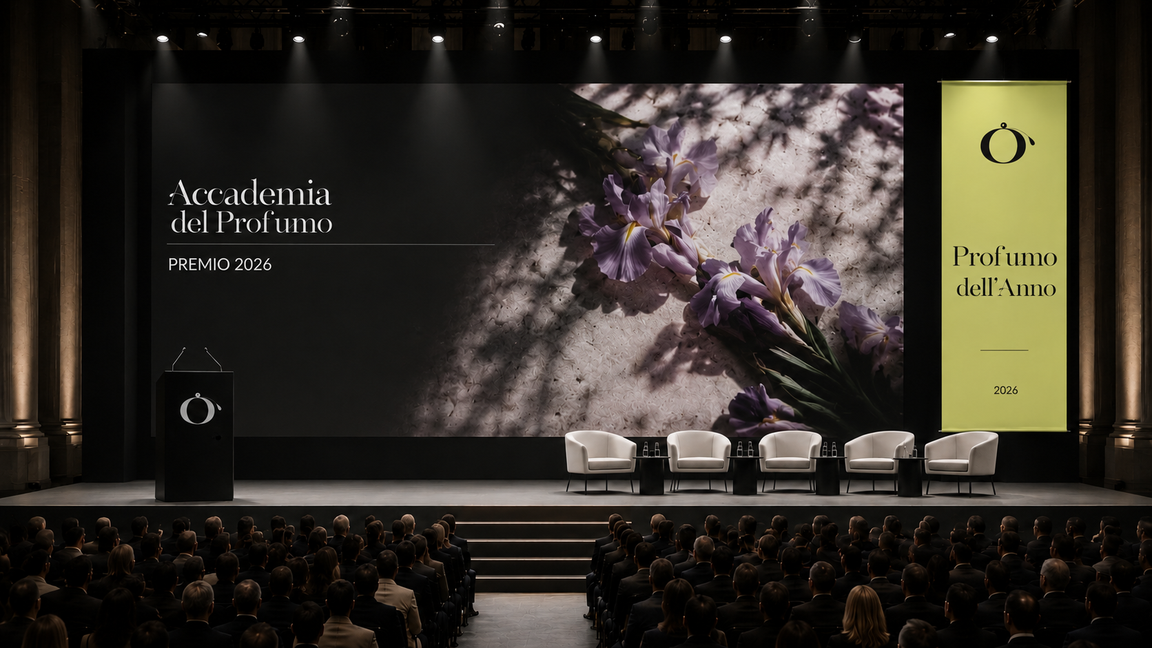
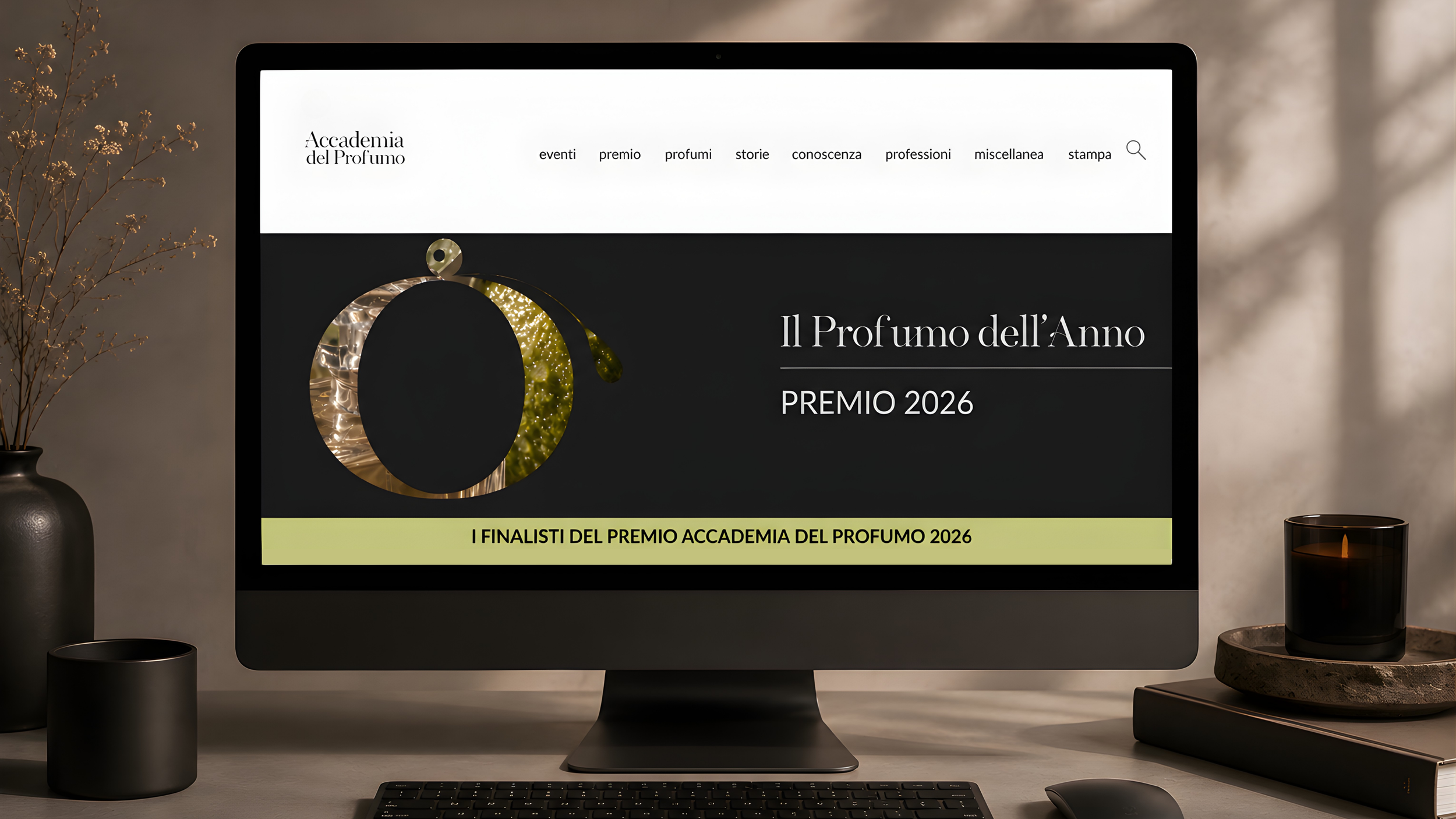
Inspired by Calabrian bergamot, this color combination was developed primarily for the communication of Il Profumo dell’Anno, linking one of Italy’s most iconic fragrance ingredients with the award ceremony.
BERGAMOTH

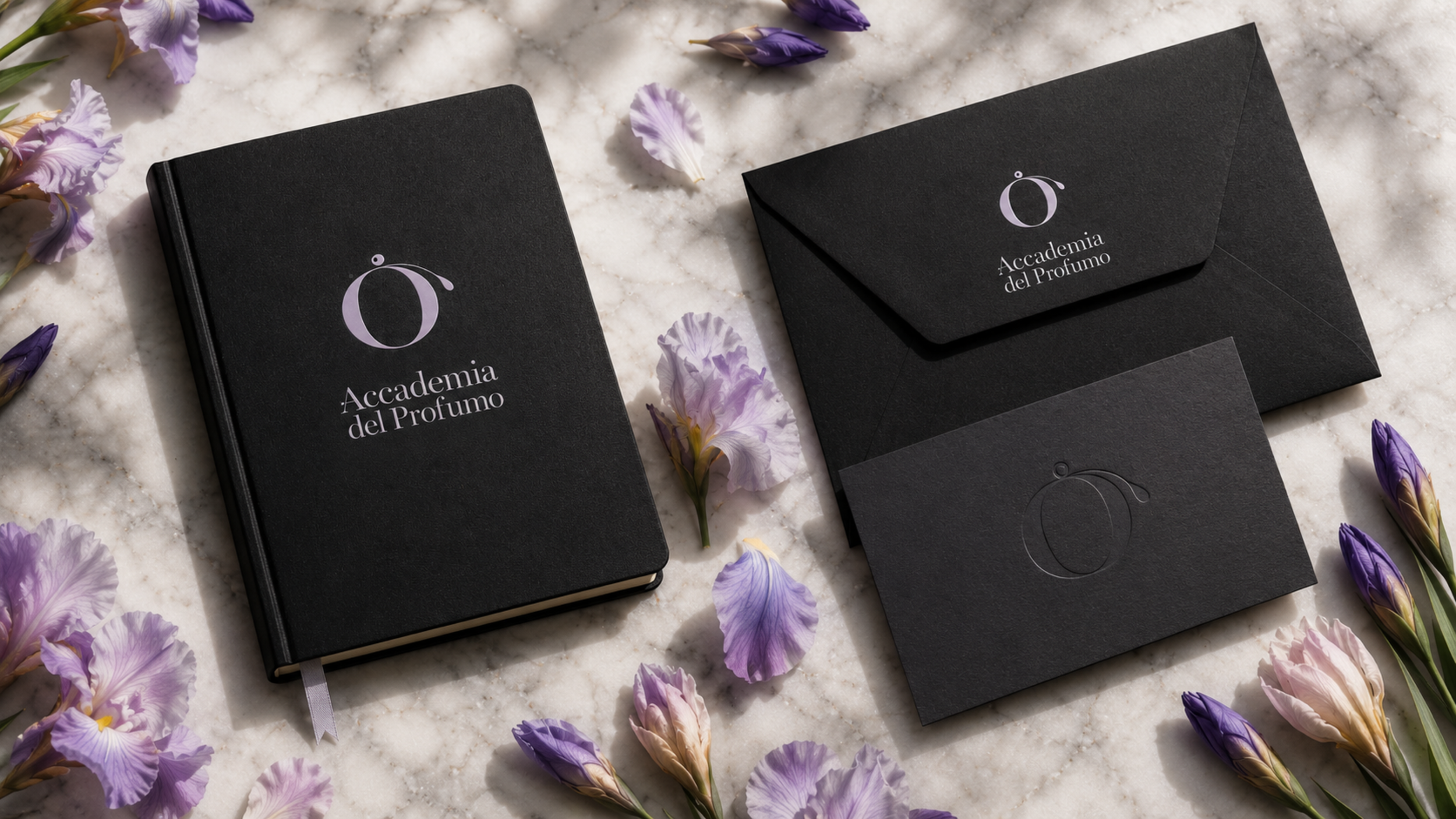
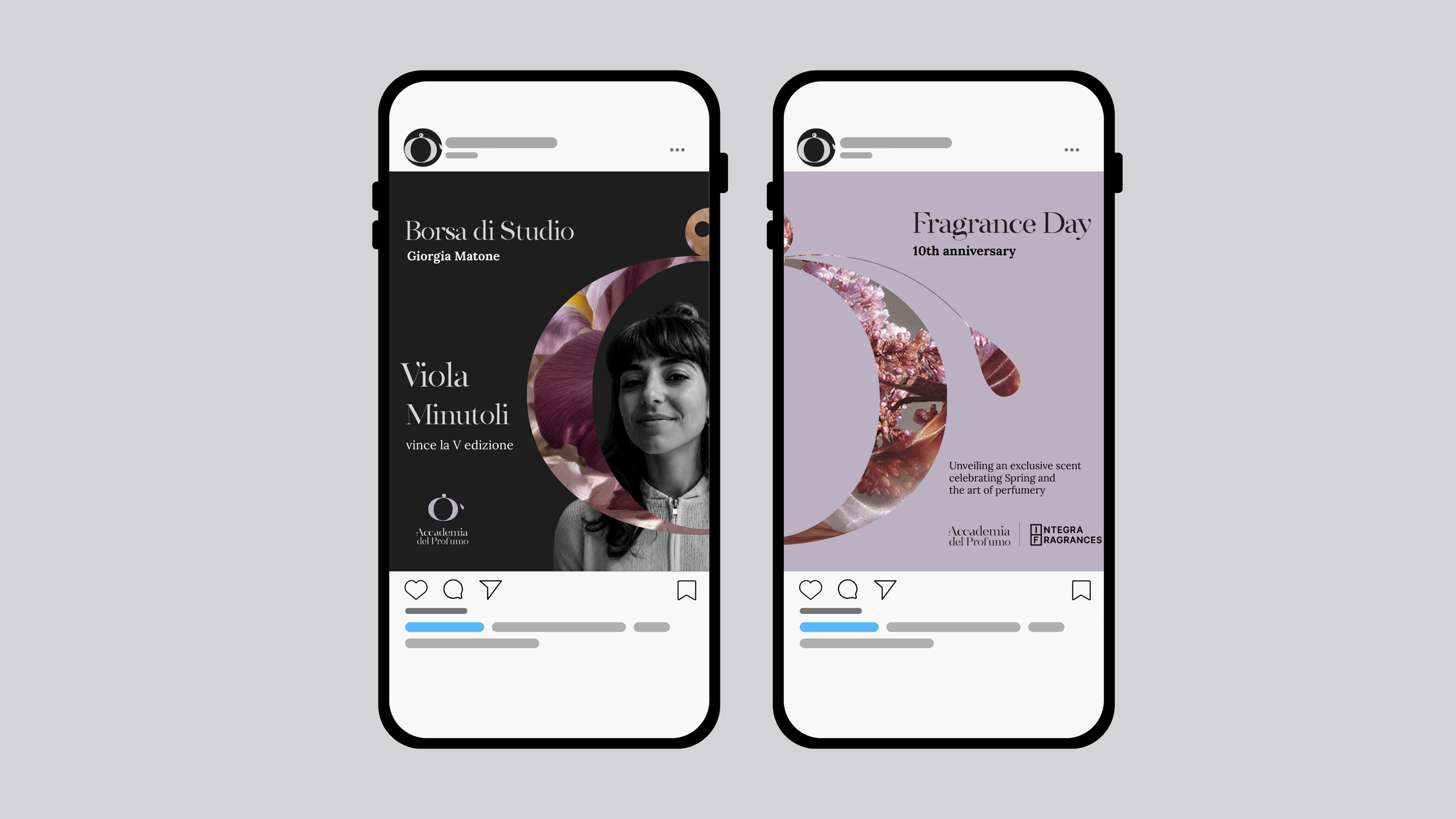
Based on the colors of Tuscan iris, this palette supports communications such as “Giornata del Profumo”, the “Borsa di Studio”, and other cultural and educational initiatives.
PALE IRIS
TYPOGRAPHY SYSTEM
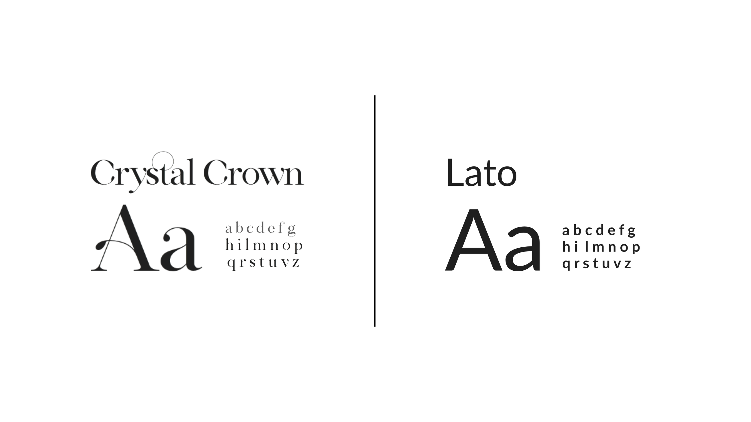
Crystal Crown acts as the expressive voice of the identity, bringing elegance and a distinctive connection to the world of perfumery. Lato balances it with a clean, contemporary structure, supporting secondary information and everyday communication without competing with the main typeface.
APLICATIONS
AWARD CEREMONY AND MERCHANDISING
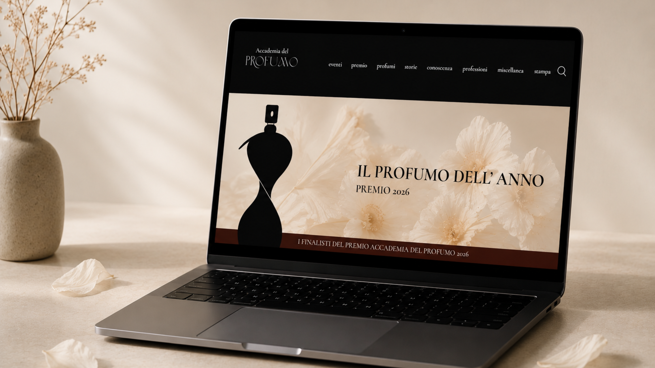
DIGITAL ENVIRONMENT
AIR IN BLOOM
Concept 2

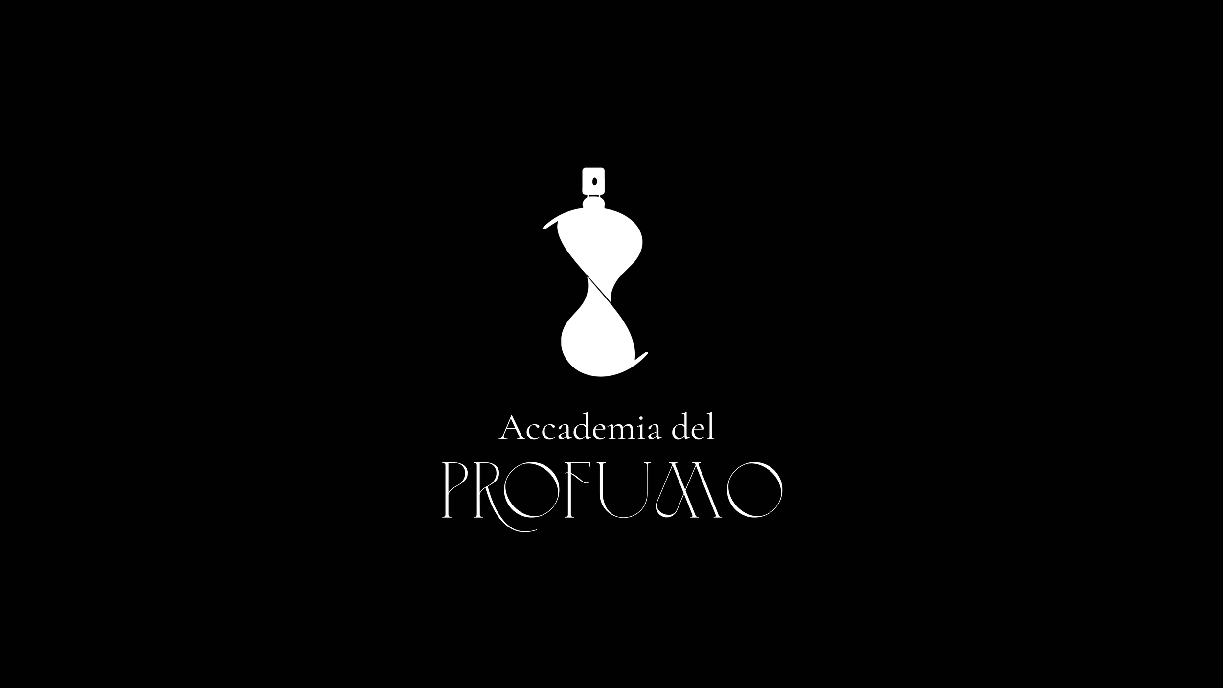
For this concept the monogram merges the letterforms into a fluid symbol that evokes two petals meeting in bloom while also recalling the curved silhouette of a perfume bottle. The result translates the softness and movement of fragrance into a distinctive brand mark.
PRIMARY LOGO
WORD MARK
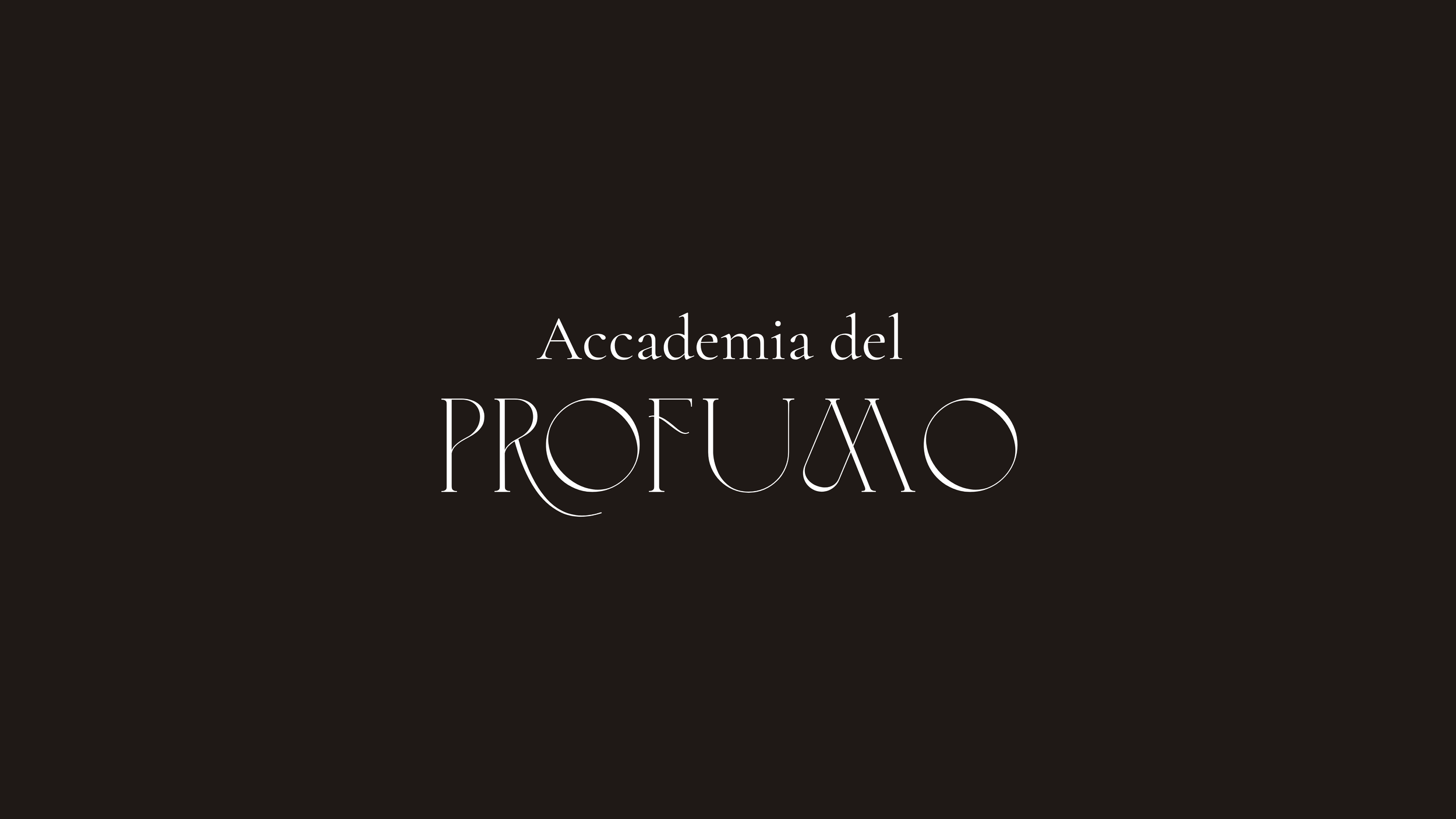
BRAND MARK

THE VISUAL LANGUAGE
A palette inspired by petals in bloom and the sensory presence of fragrance.

AN ICON SHAPED BY MOVEMENT
Soft petal tones contrast with deeper floral shades, reflecting the transition from the physical flower to the invisible scent it releases. The palette captures the warmth of spring and the delicate movement of fragrance through the air, creating a visual language that feels refined, emotional, and alive.
TYPOGRAPHY SYSTEM

Simple Serenity brings a fluid, expressive quality to the identity, echoing the organic shapes of petals and the movement of fragrance through the air. Cormorant Garamond balances it with a refined editorial structure, bringing elegance and clarity to supporting communication.
APLICATIONS
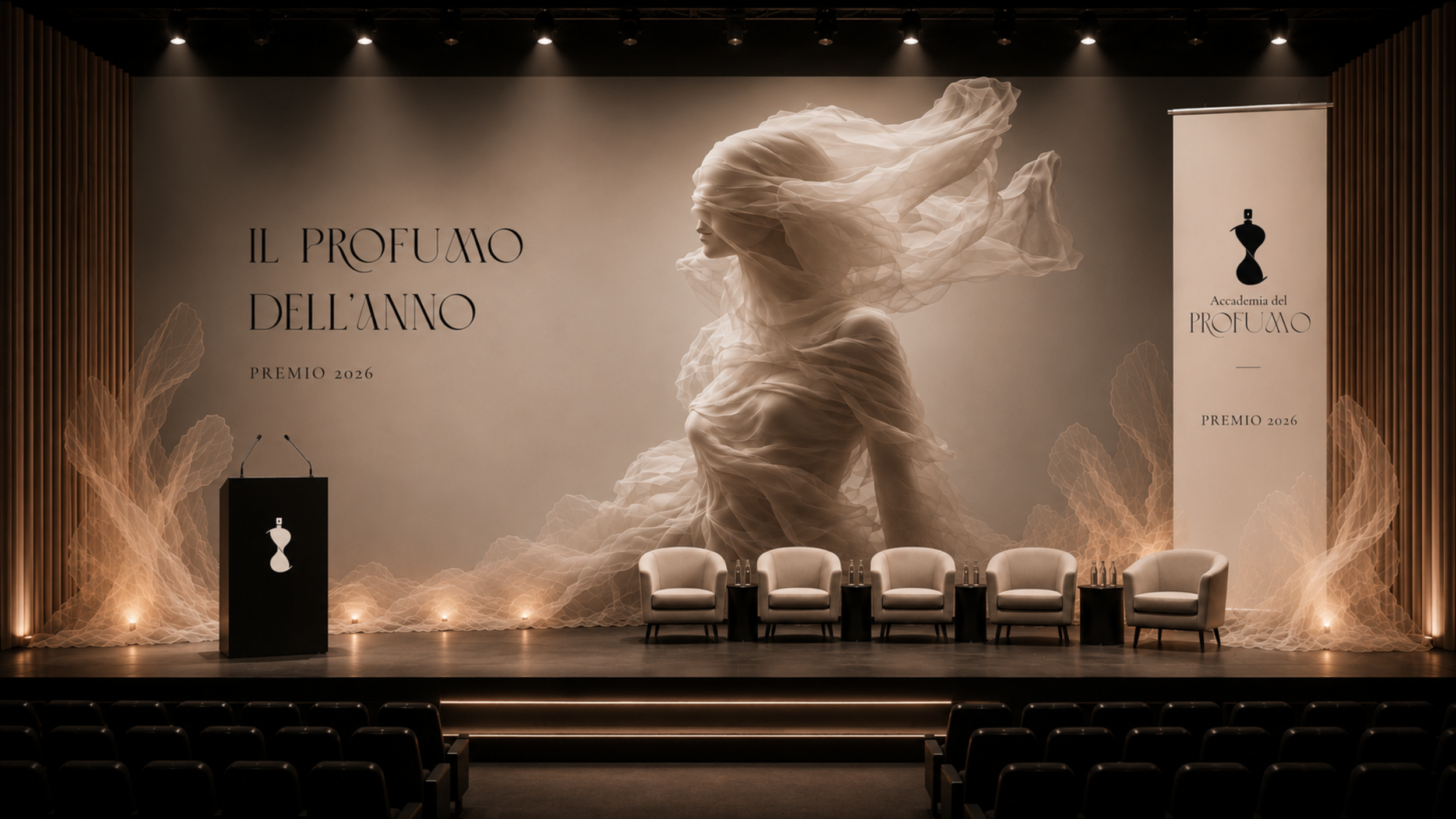
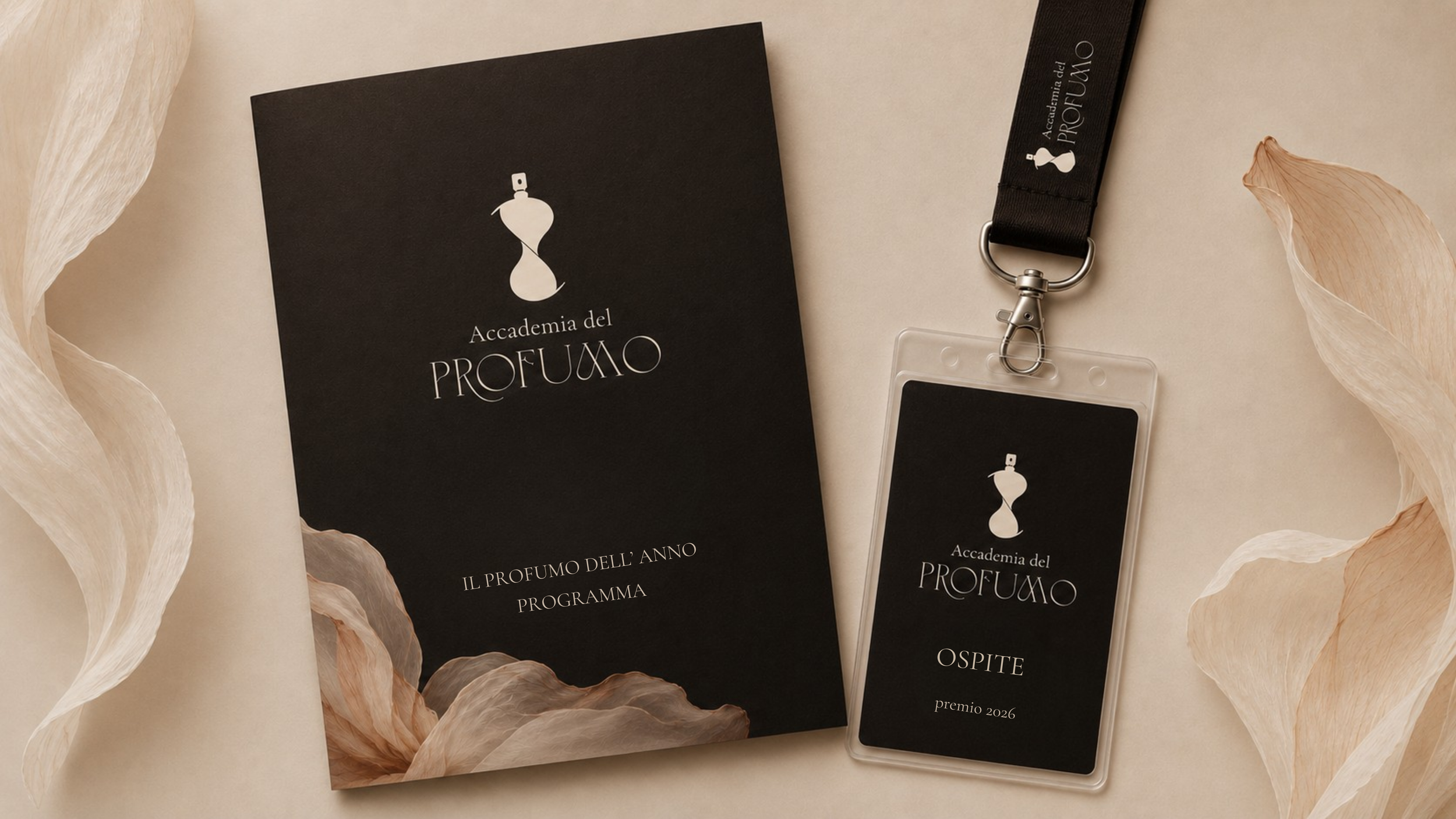
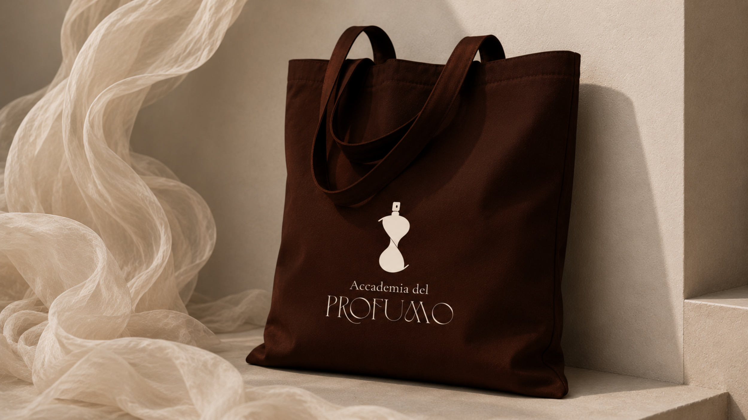
AWARD CEREMONY AND MERCHANDISING
WEB LANDING PAGE